“The best artists work out of the desire to produce beauty, otherwise it’s not real and something else. This intertwining of money, power, and status is a corruption of purpose.”
You may not recognize the name Milton Glaser, but you would most certainly recognize his art.
In 1975, Glaser created what is, perhaps, the most famous and ubiquitous design in contemporary history.
Its message is simple and so is its presentation: I ♥ NY
The year that logo was created New York was in a state of chaos: high crime rates coupled with a bankrupt economy. And so, the city’s government looked to revamp its image and provide hope to residents and hesitant visitors.
Milton Glaser was approached and commissioned with the task to create an image that included the words “I Love New York.” He accepted the challenge of helping the city he grew up in and loved, and through several redesigns, delivered the now famous logo. He was paid nothing for his design (a stipulation he gladly agreed to) and there was, and remains, no copyright on the logo as it was designed to be used by anyone to spread the positive message.
Originally it was meant to be used for a short, three-month, campaign, but the image caught on and spread like wildfire. It permeated New York and then exploded across international borders. Today, the image is just as popular and rakes in an estimated $33 million dollars every year; appearing on t-shirts, key chains, you name it. It’s also widely mimicked and used to promote multiple places and things.
In preparing to speak with Mr. Glaser, I became acutely aware of the logo’s global dominance. In Toronto alone, within the span of two observant days, I saw: an I ? NY t-shirt and bracelet, an I ? You sticker on a suitcase, and an I ? Toronto sweater. On Facebook I saw, an I ? PTBO t-shirt, and an I ? Mom shirt. On YouTube, Kendrick Lamar graced an I ? NY hoodie in his A.D.H.D. music video. It was everywhere – and the more I looked for it, the more it appeared.
However, this logo is only the tip of the iceberg in the Milton Glaser story. The image may be his calling card but it’s only one of many brilliant designs and artistic achievements. And although he receives no royalties for his biggest selling product, fret not, he’s created a prolific amount of other works that make his business plenty profitable.
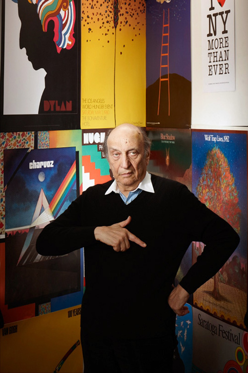
Born in New York City in 1929, Glaser has been creating commercial art for more than five decades. He cut his artistic teeth studying at Manhattan’s LaGuardia Arts High School and furthered his education studying under the minimalist master, Giorgio Morandi, in Bologna, Italy. He is the founder of PushPin studios, the co-founder of New York Magazine, and since 1974 the owner and operator of Milton Glaser studios.
Throughout his vast career he has flexed his creative muscles in a variety of ways, designing: album covers, posters, book covers, restaurants, beer labels, grocery stores, and various other brand logos.
Here’s a few of his iconic designs

![]()
Although Glaser is a highly proficient artist, he describes what he does as sitting around and “pushing pieces of paper until they look right.”Glaser once boiled down the essence of his work in to one word: clarity. Some of Glaser’s designs appear to be so deceptively simple, but that’s the point. You understand immediately what the image is meant to evoke and how it applies to the product being branded.
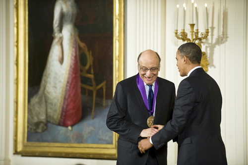
That modest assessment of his method has not gone unnoticed, and others see his artistic contribution much more profoundly. In 2004, Glaser was awarded a lifetime achievement award from the Cooper-Hewitt National Design Museum and in 2009 Barack Obama awarded him with the National Medal of Arts (past recipients include: Bob Dylan, Maya Angelou, Johnny Cash, and Meryl Streep, to name a few).
Not only has Milton Glaser continued to deliver original designs for multiple platforms, he is also a professor and board member at the School of Visual Arts and is the author of numerous books about art and design.
He is such an accomplished artist, and important American graphic designer, that his life and work prompted a 2009 documentary called “Milton Glaser: To Inform and Delight.”
There is much I WANNA KNOW from one of the world’s greatest graphic designers.
I caught up with Milton Glaser over the phone from his studio in New York City.
From the iconic I ? NY logo, to the importance of failure, to the Jonah Lehrer scandal, to the London Olympics logo, to art and spirituality, we cover it all.
…
Ryan Kohls: Congratulations on your latest book. It seems many artists either don’t want to, or are unable, to adequately talk about their art. For you, it appears to come very easily and comfortably. Do you enjoy unpacking your designs and articulating their meanings?
Milton Glaser: Well, sometimes I do enjoy it. There are some things you can’t say about your work because the experience of seeing things and talking about them are not necessarily congruent activities, but I’ve been teaching for so long, over 50 years, so you have to learn to talk about visual things. So, after a while you develop a vocabulary. If you don’t do it often it’s hard to do, but if you do it frequently you discover a way to grapple with the subject. Sometimes talking about it is a way of aiding the subject. I don’t mind talking about it as long as I understand there is a universe for looking, and a universe for talking, and they are not necessarily the same universe.
RK: I’ve come to realize that all the greats in any field have a long history of failure and rejection. You addressed yours in a section in your new book called “The Client Didn’t Get It.” What’s the biggest lesson your failures have taught you?
MG: One must assume that failure is the way we learn in general. My favorite notion is that certainty is the closing of the mind. The possibility to fail is one of the means by which we have to develop ideas, and to explore possibilities. Once you’re certain of what you’re doing the possibility of change and exploration begins to diminish. So, the idea of being an amateur constantly is an old idea for artists, particularly those who want to continue learning things they don’t already know. The idea of professionalism, which means you achieve a certain kind of success by repeating things over and over until you lose interest in them, is something that has always been frightening. What you see is people who attain a certain proficiency and then repeat that until they lose interest and the game is over.
I guess my model for this is Picasso. He was willing to give up everything once he learned how to do that. It’s always interested me that you can become proficient and once that happens the best thing to do is abandon what you know.

RK: Now that you’ve attained such a high level of success, you must be able to pick and choose the jobs you want to do. Have you been able to completely avoid the “12 Steps on the Graphic Designer’s Road to Hell” in recent years?
MG: (laughs) I wish I remember what they were. You never have the complete opportunity to reject work that comes in or you always have the opportunity to reject work that comes in. It depends on your state of mind and your consciousness. You can always reject work that a) you think is harmful or b) you think is bad to do, or you never have that opportunity. People feel, because of their economic situation, that they can never turn work down because they have to put food on the table. Or they can say, I’ll wait until another job comes along.
I have a question that I ask students and practitioners that’s very fundamental. Pick one: would you rather a) be highly respected for the work you do and make very little money? Or, b) do mediocre work and make a lot of money? You discover by asking that simple question a very different character formation in people’s lives. Some people would rather do mediocre work and live in a big house and others would be very happy doing excellent work and living modestly. That’s a very, very significant difference in people’s personalities and objectives in life.
RK: Well, let me test you to see where your principles sit these days. If Mitt Romney were to walk into your office today offering you a lot of money to design his next campaign slogan
and posters, what would you say?
MG: I wouldn’t work for Romney because one of my other principles, which can be simply expressed, is do no harm. I think Romney is a man who would create enormous harm if he was elected. On a political level, he’s simple-minded and I don’t think he knows what he’s doing. He’s a dangerous figure. The other thing about that is of course that you’re not usually smart enough to understand the consequence of your own actions, so you have to be careful about that. When people ask me, what is a designers responsiblity? I say,”To do no harm.” You can be very arrogant about what that phrase means because in life you think you’re doing good but it turns out that the act you performed was negative and you hurt people. It’s not that easy. In a conscious way I’m fully convinced that Romney is a negative personality who has no concern about others and whose interest is ego centric and driven by power. He’s not suitable for the job as far as I can see, so I would not work for him.
RK: I’ve heard you numerous times explain the trajectory of great artists: They learn to draw realistically for years and years and then have to deconstruct all that knowledge to create something relevant. When do you think that transition took place for you?
MG: I don’t know. What occurred to me early in my development was to do distinctive work. That was always something very important for me. I don’t know when that started to happen. Back in high school I tried to do it. I don’t think you become aware of when your work becomes distinctive. All I knew is that I had the persistence, willingness, and energy to pursue it. I can’t say that one day I woke up and said to myself, “You know, Milt, you really got there.” I don’t have that sense that it occurred over night. I do know that all my life the work has been at the centre.
I could say that I have received my share of awards and honors. The one that has convinced me more than any other was an individual award that President Obama gave me; the National Medal of the Arts. I could say that not too many people get that in life, so I guess I’m doing alright. But, what you realize is that it’s not what people say externally, it’s what you are critically aware of when you compare it with the best of its class and it can still hold up. It takes a long time and I’ve been around a long time.
RK: On your website the first words that pop up are “the good is the enemy of the great.” What does that phrase mean to you? And, how does it influence your daily work?
MG: “The good is the enemy of the great” is a general condition that exists, but you have to be conscious of it in professional life. Professional life is all about the good and always references what exists. When you do something that people understand, the client is always looking backwards, they’re always looking at what has already succeeded, and using the clues from the past to develop what is done in the present.
Well, artists, and people who are interested in changing ideas, don’t do that. What they do is look for the emerging ideas. The emerging ideas are dangerous, and if the reason you are doing things is for profitability, as with business, you are very careful about what is new and different. The impulse in professional life is to do things that are guaranteed and that reside in the existing history that people are familiar with. So, you can see immediately that the impulse to create something new is a contradiction in terms of what business wants to do. Business wants guaranteed success. Those two things are in contradiction.
RK: If you don’t mind I’d like to jump on the “I ? NY” train for a minute because the story of how you came up with the final “I ? NY” logo exemplifies overcoming the good to create the great. Is that fair to say?
MG: I did a logo and it was accepted by the state and I was in a cab afterwards and said, “I’ve got a better idea.” It just occurred to me that there was a simpler, more direct way, of doing it. I made a little sketch of the “I ? NY” which wasn’t what my original idea was – it was originally just two lines of typography in lozenges. And, I called up the assistant commissioner of commerce who had given me the job, Bill Doyle. I said, “Bill, I think have something better.” He said, “Don’t bug me. I just met with the commissioners and they approved it.” I said, “this is really better and I’m going to bring it over for you.” I brought it over and he said, “Yeah, you’re right, it is better.” He called up the commissioners and they agreed. So, that “I ? NY” thing which was already going to be institutionalized, turned out to have almost never come into existence except for my own persistence and feeling that there was a better way to do it. So, something that became the most familiar thing I ever did almost vanished without a thought except I intuitively felt there was a better solution.
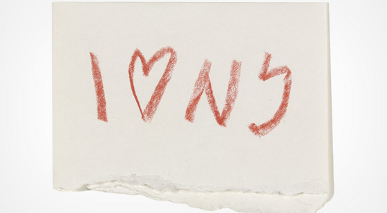
Sketched in the back seat of a cab: The original design
RK: You of all people understand how ubiquitous the logo has become. In preparing for the interview I couldn’t escape the logo, whether it was the original or an altered version. Everywhere I looked there it was. After so many years living with the design, how do you feel about it today?
MG: You know, you very rarely in your life get to do anything that is so pervasive and effective that millions of people see it and are moved by it. How would you ever dream that in every country on earth there is some manifestation of this silly little thing. You can’t go anywhere without seeing “I ? Something.” Who could have dreamed that would have happened? I still don’t understand it. It’s as universal a mark, or image, as you could find anywhere. So, it’s an absolutely miraculous thing. Functionally, it had something to do with the recovery of the city, and when I did in it ’77 the city was in really bad shape, you wouldn’t think about going out on the street at night because there was so much mugging and the city needed an affirmation that it was a great place to live. It was part of the effort to transform people’s perceptions of the city and the state. It was a pro-bono job, but it really made me feel like I had accomplished something in my life that wasn’t just selling another can of beer. That you could actually do something useful and important with the skill you had really made me feel great.
RK: You’ve been in the news recently because there’s a campaign to change the logo and rebrand it. What was your initial reaction to that?
MG: I think they started using it. It’s an advertising campaign that substitutes animated images for the heart. I think for a campaign it’s OK. When they first called me on it they said they were going to change the identity and I thought that was silly to change, what turns out to be, one of the most powerful images of our time. But that wasn’t the fact. The fact was that it was an advertising campaign that was going to last a few months and then go back to the original campaign.
![]()
RK: After 9/11 you redesigned the logo to read “I ? NY More Than Ever.” It occurred to me that you had designed a restaurant in one of the World Trade Centres called “Windows on the World.” Was that the first time your artwork was ever destroyed?
MG: I suspect, yes. Certainly so dramatically. I never thought of that. I have to say that it wasn’t part of the trauma for me. The artwork it doesn’t have that meaning to me. Doing it is significant for me. The artwork itself, I don’t have that kind of attachment with it.
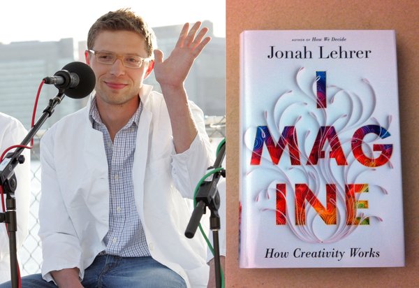
RK: The first place I heard your story about creating that logo was in Jonah Lehrer’s book “Imagine: How Creativity Works.” I’m sure you’ve been following his recent plagiarism scandal. What did you think when that news broke and did you go back and look at your quotes?
MG: Well, it was so odd the whole thing. First off, I felt so sad for the poor guy. Here he was, his future guaranteed, top of the world working for the New Yorker, writing a book that had already sold 200,000 copies, and he shot himself. How could he have done that knowing it was inevitable he would be discovered? What kind of madness? Why would anybody do that? The self-sabotage to that degree was incomprehensible. I looked back at what I had said and half of it I know I didn’t say. Substantially nothing in there was false in the sense of being true, and generally the things are right, even though they are not in terms of spirit and details correct. The vernacular wasn’t right. It was just another case of people screwing their life up. If you had modest intelligence, why would you set yourself up for the disaster of your life that would ruin your life forever? He will never recover from this.
RK: Yeah, it’s definitely a crazy story. Speaking of other crazy things, the price of art is incredible. Munch’s “The Scream” just sold for $120 million, and you have a sketch by Giorgio Morandi that you bought for 60 dollars that is now probably worth $35,000. In the past you’ve been outspoken about how the high price of art has tarnished its reputation in the eyes of the casual onlooker. Is art worth the high price some people pay, and is this debate worth continuing?
MG: It’s a great subject because, as you know, art is not a commodity. Its value has nothing to do with commodity values. So, you say, what is the relationship with art and money? In theory there should be none. And then you ask what is the relationship of beauty and money? And, what does pleasure have to do with money? And, what happens to the brain when all those neurons are stimulated and people derive pleasure from beauty? And, what is the correlation between what you are willing to pay for beauty? And what is the relationship between beauty, money, and status? It’s a fascinating topic. How do you get someone to pay 12 million dollars for a stuffed shark? All those issues about the peculiar nature of money, power, status, pleasure, the brain, are certainly worth talking about. But, what I do know is that there’s some crazy relationship between all those things and art that no one talks about. Who in the world goes to these parties and buys a painting for a hundred million dollars? Who are these people? What do they want? And, what are they buying? It’s a most mysterious world in that sense.
RK: You’ve always claimed that you didn’t want to make art to sit in someone’s house. You wanted to make public art that served a purpose. So, in that sense does artwork being sold for that price and for that purpose bother you in any way?
MG: Well, I have to say that one of the great things in life for people who want to be artists is the joy and pleasure of creating beauty. Every once in a while you create something that’s beautiful and you want people to share in that and you don’t want to receive the reward of money for it. That isn’t your primary motivation. What you want is being in the presence of something that elevates the soul. That is the great contribution you’ve made to the members of the human race. If you’re obsessed with money as your motivation it separates a mind state that will be your life. The best artists work out of the desire to produce beauty, otherwise it’s not real and something else. This intertwining of money, power, and status is a corruption of purpose.
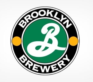
RK: In evaluating your catalogue of designs I noticed that you often use the circle. Many of your logo’s are accented with circles (e.g. Brooklyn Brewery, DC comics, etc). Is there something about that shape that works well in design?
MG: That’s an interesting question because over the last couple weeks I’ve realized I do that too. I guess it’s one of the most fundamental forms. I do use it a lot. I’m a child of modernism. I grew up in response to the Bauhaus and the discoveries of the modern area. There you reduced everything to geometry: squares, circles, rectangles, and so on. This might be the residue but that’s an interesting observation.
RK: What was your take on the London Olympics logo? It took a lot of flak from audiences and the media.
MG: Boy, do I not understand that. I have to admit, without besmerching a colleague, that it is the strangest logo I’ve ever seen. I have to say on one hand I must defend it. It deviates from the accepted form and it is so peculiar that my instinct is to say that because it violates my expectation it must be good. On the other hand, when I look at it I think, “What in the world is that?” It does not, for me, and I feel very awkward saying this, make me happy to look at.
![]()
RK: What other logo’s do you look at and think of as works of genius?
MG: The cross.
RK: What about the golden arches. Do they work for you?
MG: No, I wouldn’t call it a work of genius partially because in a physical sense it doesn’t set off those neurons in my brain. But, you’ll realize that many things through simple repetition become so imprinted on you that you think they are memorable. Sometimes they’re just memorable not because of some intrinsic uniqueness but simple repetition, that’s what I think is true of the golden arches. They would be equally memorable if there was only one or three arches.
RK: You co-founded New York Magazine in the late 60s, but then left when Rupert Murdoch took over. You’ve since said some unflattering things about the man in the press. Over the last several years he’s had a lot of negative things exposed about his practices. What do you think about what’s been happening to him?
MG: The only thing about it is that I think he’s a dangerous man to be in journalism. I think he’s willing to distort anything to accomplish his goals which are not journalistic, but are goals of power. His instincts are on the right and to support power. I’m very happy when his power is diminishing.
RK: You’ve said every drawing is miraculous. The word miracle often has a spiritual connotation. How would you describe your religious or spiritual self?
MG: The brain is a very spiritual thing. The neurons are a spiritual occurrence. You can’t understand the nature of thought. You can’t understand the nature of anything. As I said in the book, everything is miraculous. You just have to accept that. There is no reality except for the one you create in your brain. I don’t know what isn’t spiritual.
RK: Do you believe in God?
MG: I don’t really believe in anything. I think the great goal is not to believe and to accept. I mean, I accept the miraculous as a fact of my life. I accept a miracle a day or more when necessary. I don’t believe in any conception of God that I’ve heard. The idea of an old bearded guy in the sky, isn’t an idea I find acceptable. An image of God as expressed in any religious thing that I’ve eve seen is not acceptable. The fact that there is a connection between all the things in the universe is certainly acceptable.
RK: In your BigThink interview you were asked what worries you, and you said, in a seemingly embarrassed way, that you don’t worry about anything and you’ve had a great life. Having lived such a fulfilling and happy life, where do you find empathy for others in suffering?
MG: There’s a beautiful quote that I frequently repeat that Iris Murdoch said, “Love is the very difficult understanding that someone other than the self is real.” I think that’s life’s struggle to understand that others are real. Narcissism and self absorption pulls you away from that so you never think others are real. When you love someone you are suddenly aware that they are not just an extension of your needs but they exist and they have their own needs and own existence. Life is a struggle for awareness and attentiveness and it’s very hard. If you’re not aware that others exist, what is life about? Then it becomes a masturbatory exercise about you, your feelings, your needs, and it’s a very barren experience. The search in life is your connectedness to everyone. I think being in the arts helps and finding an expressive context helps in that regard.
FOR MORE INFORMATION ON MILTON GLASER:
1) Check out his website at www.miltonglaser.com
0 Comments
Trackbacks/Pingbacks